HandsOn
(Application)
This personal project is a application design enabling users to seamlessly discover, participate in, and create community initiatives, donation drives, and volunteer opportunities with ease and efficiency.
About
Role
Team
Client
Time
UI Design
UX Research
Tessa Cervantes Roth
HandsOn
6 weeks
Problem
Members of communities often struggle to find, organize, and participate in local initiatives such as clean-up drives, donation campaigns, and volunteer opportunities. Without a centralized platform, these efforts can become fragmented, leading to lower participation and engagement. Additionally, users lack an effective way to stay informed about upcoming events and initiatives, making it difficult to plan and commit their time.
Key insight
This platform will feature an intuitive calendar view, allowing users to stay informed about upcoming events and initiatives, and seamlessly plan their participation. By centralizing and simplifying access to community-driven activities, this solution will foster greater engagement, increase participation, and strengthen community involvement.
Goal
To develop a responsive platform that empowers users to easily discover, join, and create community volunteer opportunities.
Solutions
01.
Design for the intended user.
02.
Create a collective application.
03.
Focus on users interacting with events.
User research summary
The user research revealed a strong demand for a centralized platform that allows users to easily find, join, and create community initiatives such as clean-up drives, donation campaigns, and volunteer opportunities. Users currently face challenges in discovering and engaging with local events due to scattered information on various platforms and a lack of cohesive tools.
User research: pain points
Difficulty in Discovering Local Initiatives.
1
2
Fragmented Event Management for Organizers.
Lack of Seamless Event Tracking and Participation.
3
With the information I’ve gathered through user research, I developed a vision board to gather insights from comparable apps, allowing me to analyze their formats and integrate my ideas effectively.
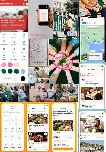
Vision board
Information Architecture (IA) application

I developed a user-friendly IA with a clear presentation of features on the homepage, ensuring a seamless user experience and minimizing potential pain points.
User Flow
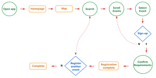
From the feedback I gathered on users pain points I created a user flow focusing on how users are able to search and sign-up for a volunteer event.

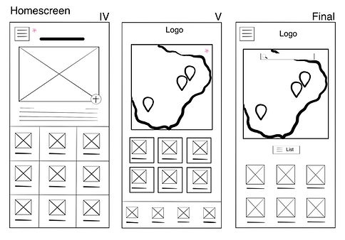
Paper wireframe
With my IA in mind I plan to create a clear walkthrough on the main pages of the app while enhancing images and minimizing text.
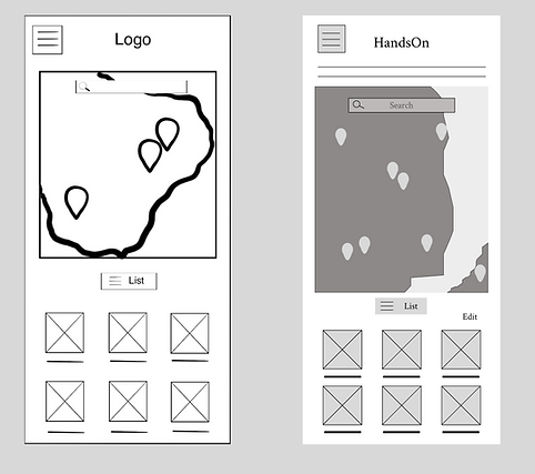
Digital wireframes
Using my information architecture and wireframes, I merged the layouts into digital wireframes. After multiple iterations, these wireframes effectively captured the user flow and addressed user needs.
Digital Wireframes
I integrated my IA and paper wireframes into a digital wireframe. After many iterations, these wireframes best represented the user flow and user needs.
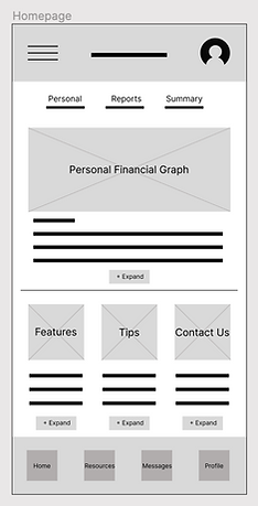
Large images, minimal text and call-to-action for more information.
A homepage where personal user information and company updates can be published instantly.
Accessible tabs to pages from navigation tab to footer of page.

Application
Website
Based on insights gathered from user input and the established information architecture, I developed a low-fidelity prototype. The design emphasizes a seamless and straightforward user experience, with intuitive navigation buttons guiding users to relevant information efficiently.
Low-fi prototype
Usability study: parameters
Study type:
Moderated usability study
Participants:
7 participants
Location:
United States, remote
Length:
25-30 minutes
1
3
Usability study: findings
1
Users expressed a preference for having their activity displayed on their profile page to allow for access to personal progress.
2
Users want more icons for resources. Adding more ways to export information from the app and posting on other platforms.
3
Users desire a more interactive and streamlined experience with the map and calendar when registering for events.
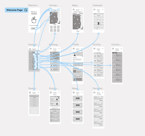
Application mockup
Based on usability study insight, I added individual events for users to click, get information, and register.

By analyzing user pain points and utilizing the information architecture I developed, I designed a unified mockup that translates these insights into a digital wireframe focused on user-friendly accessibility.
The application features a homepage and a navigation tab, providing users with streamlined access to all pages. Users can register for events via the calendar page or through the maps functionality. This design improves overall accessibility, enabling users to efficiently navigate to their desired destination.
High-fi prototype
Accessibility consideration
1
Color Contrast: I have ensured all text has a contrast ratio of at least 4.5:1 against its background to improve readability for users with visual impairments.
2
Typefaces: I am only using two typefaces, Crimson for headlines and Source Serif for body. Having too many typefaces can distract users and make app look busy.
3
Responsive Design: I have created responsive layouts to ensure that content is accessible on all device sizes, including mobile devices used by individuals with limited dexterity.
1
Takeaways
Impact:
This study sought to address the need for users to discover volunteer opportunities, post events, register, and connect with others. Through extensive research and design, and by continually expanding my knowledge, I developed a deeper understanding of the critical role user experience plays in guiding product design decisions.
What I learned:
I recognized that users may approach accessing a page through different pathways, depending on their diverse backgrounds and needs. This insight led me to prioritize identifying the collective requirements of these groups and designing adaptable solutions that accommodate various screen sizes.
Next Steps
1
Seek UX/UI feedback from experienced designers to enhance the overall design and functionality.
2
After feedback is given I will document improvements to make on the design.
3
Prioritize fixes and enhancements that address critical user issues and improve overall usability.