BugZap Finance
(Application & responsive website)
This personal project is both an application design and responsive website allowing budgeting software users to report bugs and track developers' responses efficiently.
About

Role
Team
Client
Time
UI Design
UX Research
Tessa Cervantes Roth
BugZap Finance
10 weeks
Problem
There is lack of communication through the channels for users of budgeting softwares to report encountered bugs and track developers' responses. This is leading to frustration, inefficiency, and a lack of transparency in resolving issues. There is a need for a streamlined solution that empowers users to report bugs seamlessly and track developers' responses through various devices.
Key insight
To develop a responsive website aimed at facilitating efficient bug reporting and tracking for users of budgeting software I must design for the intended user and make improvements based on their input.
Goal
My goal is to empower users to easily report encountered bugs, provide detailed information, and seamlessly track the progress of developers' responses, fostering a transparent and collaborative environment conducive to resolving issues swiftly and enhancing the overall software and user experience.
Solutions
01.
Design for the intended user.
02.
Create an interactive application & website.
03.
Focus on users communicating with developers.
User research summary
For the user research, I conducted a series of interviews and surveys to understand user experiences and pain points. Initially, I assumed that users primarily wanted a simple, one-click bug reporting feature. However, my research revealed that users not only desired ease of reporting but also a transparent and efficient tracking system for developers' responses and resolutions. This insight led me to prioritize a comprehensive yet user-friendly web design that includes real-time updates and a clear communication channel between users and developers.
User research: pain points
Lack of an efficient system for reporting bugs and tracking the developers’ responses.
1
2
Time wasted trying to find workarounds for software issues.
Difficulty in communicating software issues effectively to the development team.
3
Information architecture (IA) application

Information architecture (IA) website
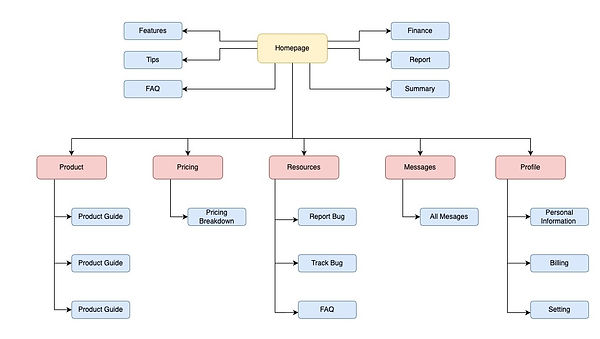
I built a user friendly IA with a straightforward presentation of features to ensure an easy user experience and reduce user pains.
User flow

From the information I gathered on user pain points I was able to create a user flow planning out how users will be able to report bugs to engineers through the webpage.
UX design storyboard

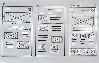


App
paper wireframe
Building on my information architecture, my objective for the app paper wireframe was to design a clear navigation tab at the bottom, highlighting the essential pages. Each page focused on its specific features, ensuring a streamlined and user-centric experience.


Web
paper wireframe
Building on my IA, my objective for my webpage paper wireframe was to create a clear navigation tab outlining the various pages, with each page focusing on its specific features, enhanced by images and minimal text.
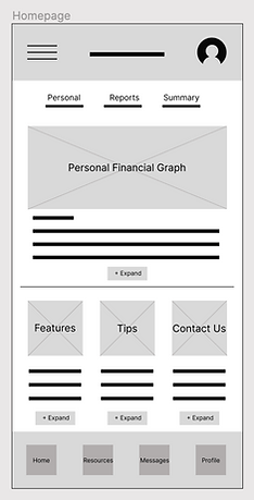
Digital Wireframes
I integrated my IA and paper wireframes into a digital wireframe. After many iterations, these wireframes best represented the user flow and user needs.
Large images, minimal text and call-to-action for more information.
A homepage where personal user information and company updates can be published instantly.
Accessible tabs to pages from navigation tab to footer of page.

Application
Website
Low-fi prototype (App)
The app is designed to make interaction with the user as simple as possible with the most important tools available at each page.
Low-fi prototype (Website)

Utilizing the information gathered from user pain points and the information architecture I created, I developed a cohesive low-fidelity prototype, integrating these insights into a digital wireframe that ensures easy accessibility.
Usability study: parameters
Study type:
Moderated usability study
Participants:
5 participants
Location:
United States, remote
Length:
20-30 minutes
1
3
Usability study: findings
1
Users had a hard time with text size. Possibly enlarging text to make it more legible for various screen sizes.
2
Users want more icons for resources. Adding more to the page, even the footer will help users in moving around the website.
3
Users want less text displayed. Too much wording distracts users and spent more time reading to find what they need.
I gathered feedback from participants that wanted to export files out of the app and also wanted to import images and files like documents and excel sheets. This addition will be more interactive and allow users to include relevant information when needed.

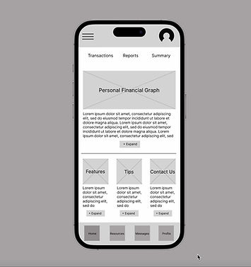
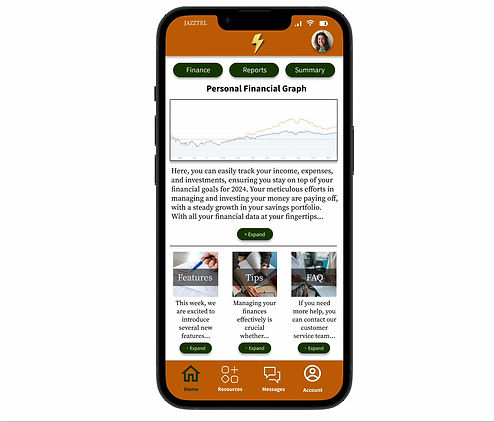
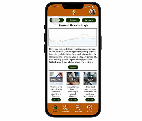
Application mockup
Utilizing the information gathered from user pain points and the information architecture I created, I developed a cohesive mockup integrating these insights into a digital wireframe that ensures easy accessibility.
I have also ensured the webpage is responsive for two screen sizes (desktop & tablet) by adjusting text and image dimensions to align with the respective screen sizes.
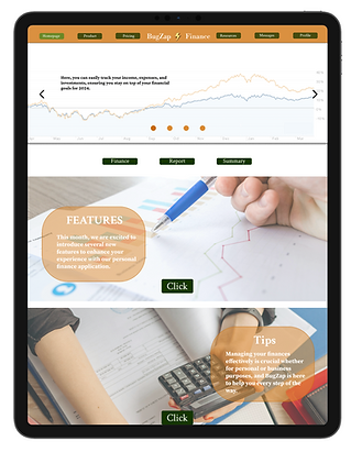
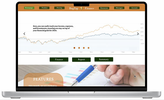
Website mockup
The webpage employs a multi-page layout, with most pages featuring carousel images. This design enhances navigation, allowing users to easily access the desired page by clicking on the navigation tab, images, or icons.
With the user research, I was able to make interaction with the app as simple as possible with the most important tools available at each page.

High-fi prototype
Accessibility consideration
1
Color Contrast: I have ensured all text has a contrast ratio of at least 4.5:1 against its background to improve readability for users with visual impairments.
2
Typefaces: I am only using two typefaces, Crimson for headlines and Source Serif for body. Having too many typefaces can distract users and make app look busy.
3
Responsive Design: I have created responsive layouts to ensure that content is accessible on all device sizes, including mobile devices used by individuals with limited dexterity.
1
Takeaways
Impact:
In this study, I aimed to address the need for users to report bugs in financial software to the engineering team. Through comprehensive research and design, I gained a deeper understanding of the importance of user experience in informing product design decisions.
What I learned:
I discovered that the webpage is utilized by diverse user groups rather than just individuals. This insight prompted me to focus on identifying the collective needs of these groups and designing solutions to accommodate various screen sizes.
Next steps
1
Seek UX/UI feedback from experienced designers to enhance the overall design and functionality.
2
After feedback is given I will document improvements to make on the design.
3
Prioritize fixes and enhancements that address critical user issues and improve overall usability.